
New Feature: Explore the Past
Are you nostalgic for that old plateau from last spring? Now, you can easily go back and re-live it!
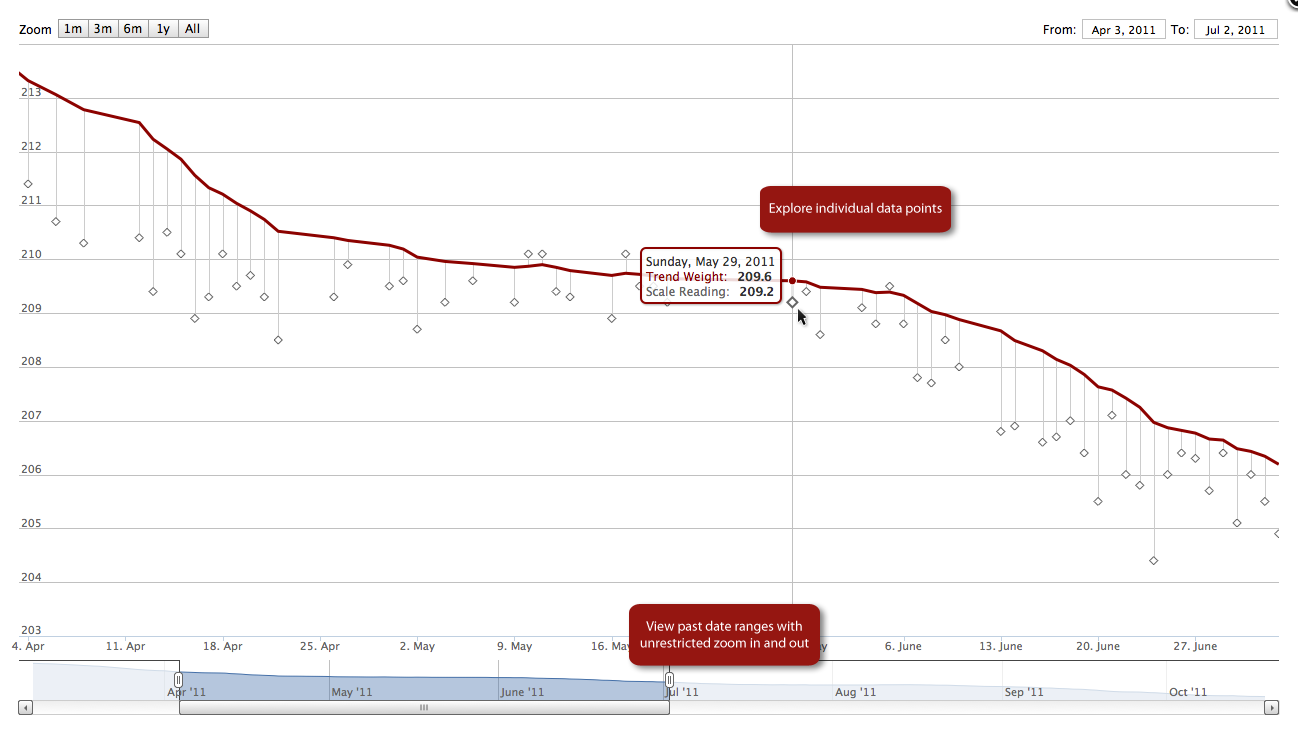
I just added an "explore" link above the chart on dashboards. This link will open a window where you can move around your weight loss timeline to see what your chart looked like at any point in the past. Maybe you want to compare your trend in November to what it looked like in June. Maybe you just want to show someone that old plateau and how with perseverance you got past it. Whatever the reason, you now have the ability.
The explore window will let you move around in your timeline freely. You can use the sliders at the bottom of the graph to zoom in and out and pick whatever time range you want (there are also quick buttons near the top left of the chart for common ranges). You can also hover your mouse over any part of the chart to see what your weight was on that day.
Here is an example of what this looks like:
You can try this out yourself here: https://trendweight.com/u/801ebeebdd3a4b
FYI, for those interested, the explore feature uses the excellent Highstock graph control from highcharts.com.
